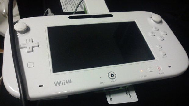
Gamesradar picked up this image from Twitter (which has now been taken down) posted by a QA tester of some game no one cares about, and look what he have here. This is by no means the final form of the Wii U controller, but the improvements shown in this image are exciting.
The biggest things you will notice are a change of the analogue nubs to actual sticks, and that the start/select buttons have moved from the center of the controller to the right side, mimicking DSes of old. These changes are definitely welcome, as there is no reason to have slidy nubs on this thing. NO REASON AT ALL.
Urge to own a Wii U: RISING.